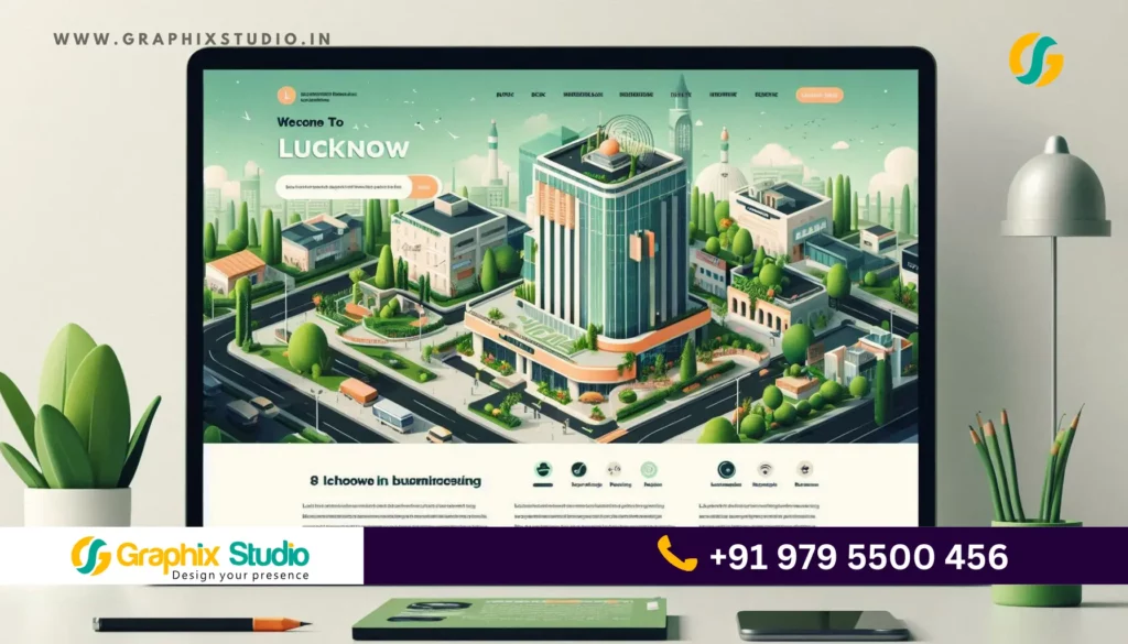
In today’s competitive market, a well-designed website is essential for Lucknow-based businesses looking to stand out. A website acts as a digital storefront and is often the first impression potential customers have of your business. However, even minor mistakes in web design can lead to high bounce rates, lost leads, and frustrated customers. Here are some common web design mistakes to avoid to make sure your website is as effective as possible.
1. Ignoring Mobile Responsiveness
With the growing number of people accessing websites via mobile devices, especially in a city as digitally savvy as Lucknow, not having a mobile-responsive site can be a huge drawback.
- Why It’s a Mistake: Mobile users expect a seamless browsing experience. If they need to zoom in or if your website elements don’t adjust to fit their screens, they’ll likely leave and go to a competitor’s site.
- How to Avoid It: Implement responsive design so that your website automatically adjusts to various screen sizes. Test the website on multiple devices to ensure it functions well on all screen types.
Tip: Google favors mobile-friendly websites in search rankings, so a responsive design can also help improve your SEO visibility.
2. Overloading with Content and Cluttered Design
A cluttered, information-heavy website can overwhelm visitors. Many businesses make the mistake of trying to cram too much information onto one page, making it hard for users to focus on what’s important.
- Why It’s a Mistake: When visitors are bombarded with text, images, and offers, they may feel lost and quickly leave the site. It detracts from the user experience and can hurt conversions.
- How to Avoid It: Focus on clean, minimalist design. Prioritize key information and use white space strategically to give your content room to breathe.
Need a clean, user-friendly website? Graphix Studio specializes in designing clutter-free sites that prioritize user experience for Lucknow businesses.
3. Slow Page Loading Speed
Page speed is a crucial factor in user experience. Many users abandon websites that take more than a few seconds to load, which can lead to high bounce rates and lost business.
- Why It’s a Mistake: Slow loading speeds frustrate users and can harm your website’s SEO ranking. Google and other search engines consider page speed as a ranking factor.
- How to Avoid It: Optimize images, use browser caching, and reduce HTTP requests. Also, use performance-testing tools like Google PageSpeed Insights to monitor and improve loading times.
Pro Tip: A content delivery network (CDN) can help speed up load times for visitors across various locations by storing copies of your website on multiple servers.
4. Missing Clear Calls to Action (CTAs)
Calls to action (CTAs) guide users on what to do next, whether it’s signing up for a newsletter, making a purchase, or booking a service. Failing to include clear CTAs can result in users leaving without taking any meaningful action.
- Why It’s a Mistake: Without CTAs, users may not know how to proceed, which means missed conversion opportunities.
- How to Avoid It: Place CTAs prominently on each page, particularly at the top, in the middle, and at the end. Ensure they stand out visually by using contrasting colors and actionable language like “Get Started” or “Book a Free Consultation.”
5. Using Outdated Design and Visuals
First impressions matter, and an outdated design can make your business look unprofessional or out of touch. In a vibrant city like Lucknow, where consumer expectations are high, a modern design can help you build credibility.
- Why It’s a Mistake: An outdated design may imply that the business is stagnant, deterring potential clients.
- How to Avoid It: Keep up with design trends, but ensure they align with your brand identity. Clean layouts, professional photography, and updated typography are small tweaks that make a big difference.
Tip: Conduct a website refresh every few years to maintain a modern and appealing look.
6. Poor Navigation and User Experience (UX)
Good navigation is the backbone of user experience. Confusing menus, too many options, or a lack of structure can frustrate visitors and lead to higher bounce rates.
- Why It’s a Mistake: Visitors won’t stay if they can’t find what they’re looking for easily. A poor UX reflects poorly on the brand and may deter users from returning.
- How to Avoid It: Create a clear, intuitive navigation structure. Limit the number of main menu items, include a search function, and consider the user journey when planning site architecture.
7. Neglecting SEO Basics
No matter how beautiful a website is, it won’t be effective if customers can’t find it. Optimizing for search engines helps you attract organic traffic and reach more customers in Lucknow.
- Why It’s a Mistake: Without basic SEO practices, your website may not appear in search results, which can limit visibility and hinder business growth.
- How to Avoid It: Incorporate relevant keywords, optimize meta tags, and use descriptive alt texts for images. Also, implement a local SEO strategy by creating content and using keywords related to Lucknow.
Pro Tip: Regularly update your website’s content to keep it relevant and rank higher on search engines.
8. Not Using Analytics to Monitor Performance
Analytics provide insights into how visitors are interacting with your website, helping you understand what’s working and what isn’t. Without tracking, it’s challenging to know where improvements are needed.
- Why It’s a Mistake: Without data, you may be unaware of high bounce rates or low-performing pages, missing opportunities for optimization.
- How to Avoid It: Use tools like Google Analytics to track metrics such as user behavior, bounce rate, and traffic sources. Set up goals and monitor conversions to see how well your site is performing.
Tip: Regularly review your website analytics to adapt to changes in user behavior and optimize as needed.
9. Disregarding Accessibility Standards
Accessibility ensures that all users, including those with disabilities, can navigate and interact with your website. Neglecting this aspect limits your audience and can lead to potential legal issues.
- Why It’s a Mistake: Lack of accessibility can exclude potential customers and reflects poorly on the inclusivity of your brand.
- How to Avoid It: Implement features like alternative text for images, clear contrast between text and background, and keyboard-friendly navigation. Following accessibility standards benefits all users, improving overall user experience.
Tip: Review Web Content Accessibility Guidelines (WCAG) to help ensure your website meets accessibility standards.
10. Using Generic Stock Photos
While stock photos are a quick and easy way to add visuals, using generic images can make your website look impersonal and reduce trust. For Lucknow businesses trying to build a local brand identity, custom visuals are more effective.
- Why It’s a Mistake: Stock photos lack authenticity and can make your website feel generic. Users may perceive the business as less genuine or trustworthy.
- How to Avoid It: Invest in high-quality, custom photography that showcases your business, team, and products. Authentic images help establish credibility and make a positive first impression.
Tip: If custom photography isn’t an option, use carefully selected stock photos that align closely with your brand’s personality.
Conclusion
Creating a high-quality website involves more than just an attractive design. Avoiding these common mistakes can make a significant difference in user experience, search visibility, and conversion rates for Lucknow-based businesses. From mobile responsiveness to user-friendly navigation and authentic visuals, a well-designed website will better serve your customers and build trust in your brand.
At Graphix Studio, we understand the unique needs of Lucknow’s market. We offer expert web design solutions that avoid these common pitfalls, ensuring your website becomes a powerful asset for your business. Contact us to get started on creating a site that engages your audience and drives growth!
