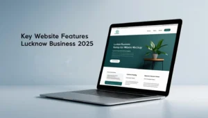
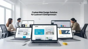
As Lucknow’s business landscape evolves, more entrepreneurs and professionals are recognizing the importance of a strong online presence. With a growing digital market, having a responsive website that adapts seamlessly to different devices is critical for attracting and retaining customers. Responsive design enhances user experience, improves SEO, and positions your business for greater success in the local market.
In this guide, we’ll explore why responsive design is essential for Lucknow’s businesses and share practical tips for creating websites that engage users across all devices.
1. Why Responsiveness Matters for Lucknow’s Local Businesses
In a city like Lucknow, where smartphone usage is high and internet access continues to expand, people rely heavily on their devices for browsing and shopping online. Responsive websites adapt to various screen sizes, ensuring a positive experience whether someone is browsing on a smartphone, tablet, or desktop.
Here are the key benefits of responsive design for local businesses:
- Better User Experience: Customers can easily navigate a responsive website without constant zooming or scrolling. This smooth experience is essential for retaining visitors and building trust.
- Improved SEO: Google prioritizes mobile-friendly sites in search rankings, especially for local searches. By building a responsive site, you can improve your SEO and be more visible to potential customers in Lucknow.
- Cost-Effective Maintenance: Managing a single, responsive website is simpler and more affordable than running separate versions for mobile and desktop. This setup saves time and ensures consistency across platforms.
Want to make your website responsive and user-friendly? Contact Graphix Studio for tailored web design solutions that meet the unique needs of Lucknow’s market.
2. Key Features of a Responsive Website
To ensure your website meets the highest standards of responsiveness, it’s important to incorporate a few essential elements:
- Flexible Grid Layouts: Use grid layouts that adjust fluidly to screen sizes. This way, content, images, and navigation are displayed proportionally and remain visually balanced across devices.
- Optimized Images: Large images can slow down your website on mobile devices. Use responsive image techniques, such as compressing images and implementing “lazy loading” (loading images only as the user scrolls down), to ensure faster load times.
- Scalable Fonts and Buttons: Choose font sizes and button styles that are easy to read and click on all devices. Navigation buttons should be large enough for touchscreens but balanced for desktop users.
- Consistent Design Elements: Colors, fonts, and logos should remain consistent throughout the site. A cohesive design enhances user trust and helps build brand recognition.
3. Mobile-First Design: A Crucial Approach for Local Audiences
A mobile-first design approach involves designing for smaller screens first and scaling up for larger screens. Since many people in Lucknow access the internet via mobile devices, a mobile-first website is essential to meet the expectations of local users.
Some tips for adopting a mobile-first approach include:
- Prioritize Content: Make sure essential content, such as your services and contact information, is front and center on mobile screens.
- Simplify Navigation: Use dropdown or collapsible menus for easy navigation on small screens. Focus on a clear, accessible layout that minimizes clutter.
- Test Responsiveness on Multiple Devices: Test your website on a variety of devices and screen sizes to ensure consistent performance. Regular testing helps identify and resolve any design issues that may affect user experience.
Ready to optimize your website for mobile-first users in Lucknow? Partner with Graphix Studio for responsive web design that appeals to your target audience.
4. Local SEO for Responsive Websites
A responsive website is not just about design; it also contributes to SEO, especially for local searches. Local SEO is essential for businesses in Lucknow looking to attract nearby customers. Here are some best practices:
- Optimize for Local Keywords: Include location-specific keywords like “Lucknow bakery” or “Lucknow fitness center” throughout your website content, metadata, and headers.
- Focus on Speed: Google ranks fast-loading sites higher, especially for mobile searches. Compress images, use caching, and keep scripts lean to ensure quick load times on all devices.
- Use Structured Data Markup: Implement structured data markup (schema) to give search engines more context about your business. For local businesses, markups like “LocalBusiness” or “Organization” can enhance search visibility.
5. Leveraging Social Media for Local Engagement
Social media is a powerful way to drive traffic to your responsive website, especially for local businesses in Lucknow. A responsive website ensures that when users click through from platforms like Instagram or Facebook, they enjoy a seamless browsing experience.
- Link to Your Website from Social Profiles: Add your website link to your social media profiles so users can easily access your services.
- Promote Mobile-Friendly Features: Highlight features like online booking or store location finders, which are particularly useful for mobile users.
- Share Localized Content: Post about Lucknow-specific events, trends, or local news to engage with your audience and build connections within the community.
6. Analytics and Ongoing Optimization
A responsive website is an ongoing project. As technology changes and user behavior evolves, regular updates and adjustments are essential to maintain optimal performance. Analytics tools such as Google Analytics and heatmaps can help you monitor user behavior and identify areas for improvement.
- Monitor Bounce Rates: High bounce rates can indicate poor user experience. Adjust your layout or content strategy based on analytics insights.
- Track Local Keywords: Keep an eye on how your site performs for Lucknow-related keywords and refine content as needed.
- Adapt for New Devices: Ensure your website is compatible with new devices and screen sizes, such as the latest smartphones or tablets.
Conclusion: Responsive Design for Local Business Growth
In a growing market like Lucknow, having a responsive, well-optimized website can set your business apart and attract more local customers. From mobile-first design to local SEO, creating a website that adapts to various devices will help you build trust, enhance visibility, and engage users effectively.
For Lucknow’s businesses aiming to establish a strong online presence, responsive web design is a must. At Graphix Studio, we specialize in building responsive websites that cater to local audiences and support business growth. Get in touch today to see how we can help you succeed online!


